Uploaded by Zerowinger .")


")

")
4200x2800 PNG 7.21 MB
Interested in advertising on Derpibooru? Click here for information!
Help fund the $15 daily operational cost of Derpibooru - support us financially!
Description
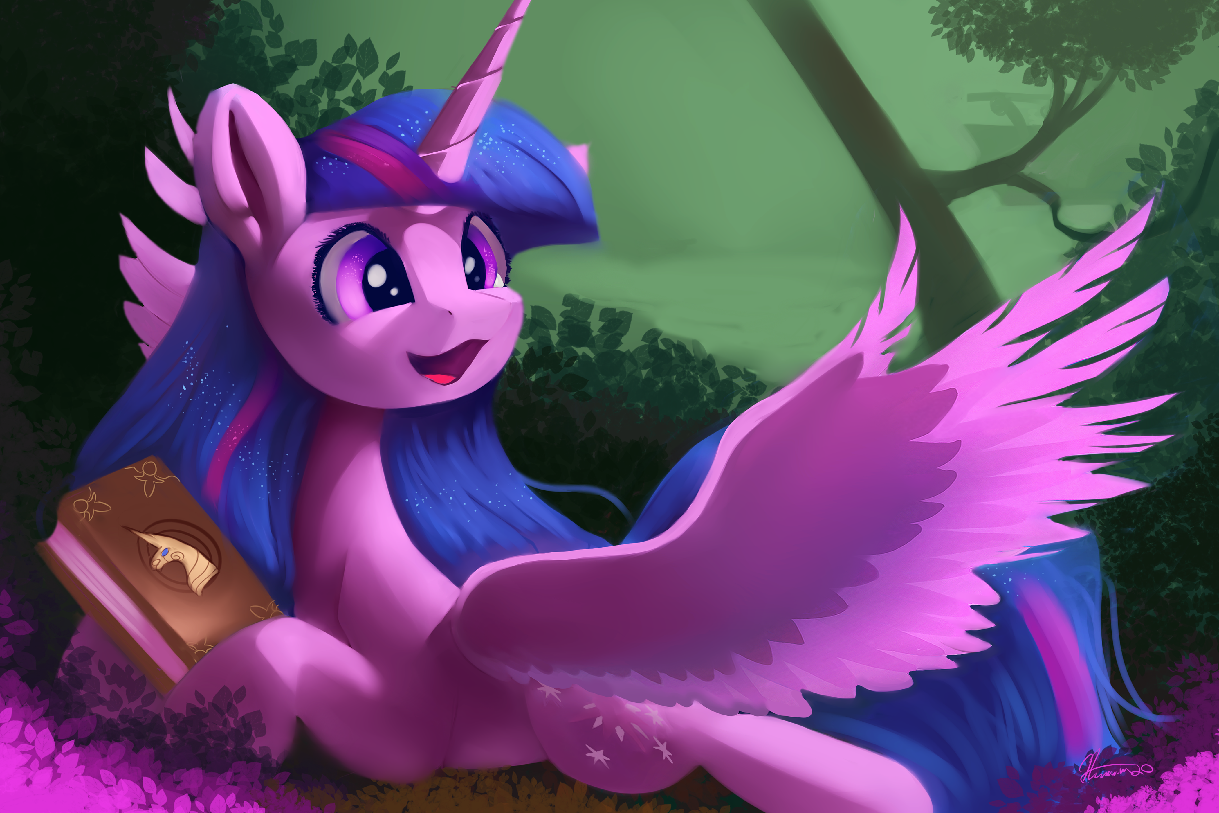
Artist’s description:
“A callback to MLP-FIM’s season 1, Episode 1. Happy anniversary to MLP, It’s come a seriously long way.”
“A callback to MLP-FIM’s season 1, Episode 1. Happy anniversary to MLP, It’s come a seriously long way.”
@Background Pony #F935
Thanks! I’ve just been trying to improve to make my ponies have much more appeal/character and more cutesy.
But It’s tricky with my lighting and shadow. Perhaps, y’all know artist’s That may be interesting for me to study?
With proportions/anatomy.
But thanks for the input from both of y’all!
First of all, I take offence for calling me a dick for expressing my feeling of being scared of a small winged horse draw.
Also you imply I dislike the drawing, witch I did not specifically stated on my comment.
Second, sorry for forgetting answering your question cosmig but essentially what #F935 is what i feel like about your drawing
(Not BGP #4B26)
Twilight’s head appears detached from her neck, and her right-side back mane appears to flow into her neck. It’s not scary though, that BGP is just a dick.
Me personally, I love the art. From all that I’ve seen from you(?), the lighting and shading is gorgeous, and so are the settings. I believe the biggest thing to work on is perfecting your interpretation of pony anatomy so that it balances the mixture of real and unreal.
Is twilight’s design and proportions make her uncanny?
How does it scare?
Is there a way to make her design much more cute? What would
you suggest?