Uploaded by mycarhasaMoustache 

1908x2456 PNG 1.36 MB
Interested in advertising on Derpibooru? Click here for information!

Help fund the $15 daily operational cost of Derpibooru - support us financially!
Description
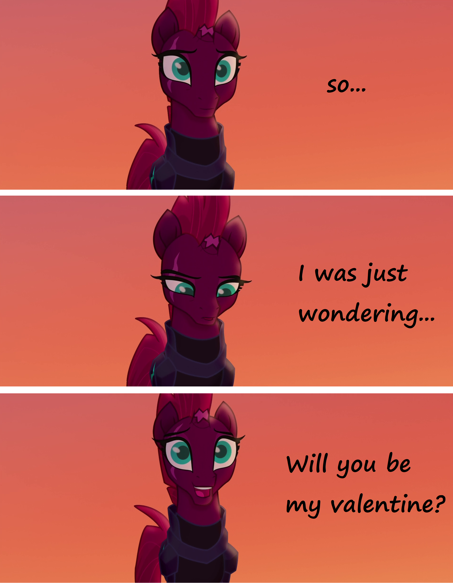
She asked you a question, Don’t leave her hanging.
Edited version of the short comic by Backgroundpony With easier to read font and no sad ending.
My only flaw with the font you chose is it’s hard to read on my crappy phone lol, I assume I am not the only one using and ancient iPhone.
I would have never noticed the font’s significance if you had not shared it with us. That’s pretty cool how you used “Fingerpop”.
Oh I like this post as well.
But if someone goes out of their way to “credit” me. I like to talk about creative processes.
Heck for my understanding mycarhasaMoustache did not need to credit me.
Those are screenshots from far better artists that we just edited.
Nop, the only wrong side of the bed is the cold outside. And as I remember I woke up, snuggled my pony plushie waifu and went to work as always.
Anyways I still like this post and appreciate the previous version effort.
Hmm. I do believe someone woke up on the wrong side of the bed this morning.
The edit looks better aesthetically and finishing with an open question is very common, isn’t it?. In this way the reader chooses the ending. You can read the comic and say to yourself (or in the comments) : “yes, of course” or “buck you, no!”
That’s my thought.
Edited because: Bad grammar
Maybe I am just old fashion but having an end in a story/comic is the point.
Just asking a question and leaving it open… Schrödingers Catcomic.
You could have done a Happy End but you decided to be pointless.
It’s not comic sans and I wasn’t talking about the font, I was talking about the ending being left to the reader to decide. Instead of being pointlessly depressing.
Yes mine being a downer has nothing to do with the rating in a community obsessed with cute faces and forgiveness.
Totally your comic sans makes ALL the difference. Not the tone shift to an hopeful bliss. XD
Does not change the fact the font was hard to read and I leave it up to the reader to decide. Judging by the ratings the community agrees with me.
For it is leaning on her real name and is a bit odd and out of place like she is/was.
Also adding you limbo version to the description.
But why didn´t you go all the way with a definitive happy ending?
A huge YES in the last picture for example.
Of course I will. ^^
That’s got to be the most evil thing i’ve ever read 😰
You want sum waifus, do you?