Uploaded by Background Pony #AA66
1280x719 PNG 862 kB
Interested in advertising on Derpibooru? Click here for information!

Help fund the $15 daily operational cost of Derpibooru - support us financially!
Description
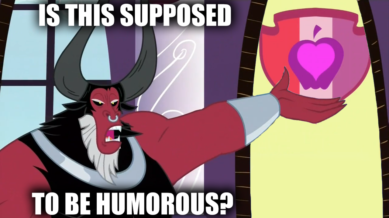
This Is just how I feel after watching crusaders of the lost mark
Tags
+-SH safe2283125 +-SH apple bloom62403 +-SH lord tirek6480 +-SH crusaders of the lost mark1804 +-SH g42124896 +-SH my little pony: friendship is magic269184 +-SH cutie mark crusaders23282 +-SH cutie mark drama6 +-SH duckery in the description220 +-SH exploitable meme33818 +-SH female1913825 +-SH is this supposed to be humorous94 +-SH meme97428 +-SH op is a duck5003 +-SH op is a slowpoke161 +-SH op is trying to start shit3170 +-SH solo1504961
Source
not provided yet
Loading...
Loading...
Pointing out? That implies that those criticisms are objective and not just a product of your viewing experience.
The scariest part is the fact that all of those tags have other meanings besides, “Oh, gosh, I’m really diddly darn mad about this, amigo friend buddy pal chum,” yet they just used them anyway. I have to wonder if they just went through a list of a myriad of ways to say “I don’t like this” on standby and just went through them all to see which tags actually freaking existed just so they don’t look like some pretentious jackwipe by making new tags to fully capture their sheer disgust.
Whatever, I’m removing them. OP: you’ll just have to stick with being a crap-spewing duck.
I think in this case the problem is how OP expressed his opinion initially. Later he left a comment leaving a more reasonable explanation as to why he dislikes the designs and people were more willing to listen to him then.
On a side note, The CMC’s Cutie Marks are NOT bad at all. So I say you’re one of the biggest ducks on the internet. Go fly south for the winter, or forever! >:(

your current filter.how?
It’s more about how they designed them. They almost look good, but for one, they’re too small and the color schemes suck.
The intent of the color scheme is to represent the colors of each member’s mane. And personally, I think this would be fine if it was just the shield that had this color scheme. The problem is that the inner parts are also this color scheme, and that makes it really hard to see the inner parts in distance shots.
Personally, I like them overall, but that’s my only real problem with the color scheme. And yeah, they’re definitely way too small.
https://vintage.ponychan.net/chan/arch/src/130855419511.png
angry, but*
I was shooting less for horrified and more for angry. but no problem c:
I was hoping someone would post a horrified Papyrus. Thank you for being that person.
@FanOfMostEverything
“NYEEEEEEEEH!!!”
Also, the cutie mark’s designs are the only real problem I had with this episode.
Another also, Yes I’m a slowpoke. I held off watching the show for 5 years until binging on it earlier in the fall. I regret not watching a single episode up to that point entirely.
Apple Bloom has a heart within an apple. My headcanon for the time being is that this represents the love she has for her family and how much she likes helping ponies in need. She gets the credit for helping Troubleshoes Clyde figure out what his cutie mark meant. Skip forward to “Crusaders of the Lost Mark” and the same can be said about Diamond Tiara. It was Apple Bloom that suggested that she and her friends should go and check on Diamond Tiara, even after everything she had put them through.
An apple with a heart is a perfect cutie mark for Apple Bloom, and the shield to match her friends just makes it even more perfect.