Uploaded by Background Pony #B01B
1024x432 PNG 167 kB
Interested in advertising on Derpibooru? Click here for information!

Help fund the $15 daily operational cost of Derpibooru - support us financially!
Description
No description provided.
Tags
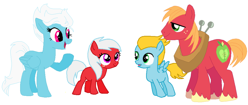
+-SH safe2282673 +-SH artist:takoyamafan231 +-SH big macintosh34972 +-SH fleetfoot2767 +-SH fleeting red11 +-SH pearmain11 +-SH oc1011358 +-SH oc:candied apple4 +-SH oc:ricochet24 +-SH earth pony551861 +-SH pegasus543908 +-SH pony1712766 +-SH g42124493 +-SH 1000 hours in ms paint7502 +-SH alternate hairstyle40947 +-SH big macintosh's yoke716 +-SH folded wings25136 +-SH freckles49407 +-SH horse collar1206 +-SH male590413 +-SH ms paint7606 +-SH offspring52175 +-SH parent:big macintosh4344 +-SH parent:fleetfoot90 +-SH parents:fleetmac13 +-SH ship:fleetmac91 +-SH shipping268409 +-SH stallion216153 +-SH straight189385 +-SH unshorn fetlocks54912 +-SH wings253969
Loading...
Loading...
And I’m just thinking the colt and filly should be named Turbine and Byfleet, respectively.
Sour grapes would imply this artists recolor of two ponies (yes, the female she recolored is a background filly) are actually good.
Which they’re not.
Honestly, saying “I bet you can’t do better” is a lame ass excuse for horrible art. Whether or not someone can do better doesn’t change the fact that this copy paste recolor mspaint job is extremely ugly. Not to mention, unoriginal and uncreative to boot.
One, my ponies aren’t uncreative. At least I try.
And two, this is the internet. Some people are going to voice their opinion in a rude (I guess if that’s how you’ve seen my comment, then you must have thin skin) ways. Just move on.
What it has to do with your artwork is that, if what you say is true, you were in the same boat as this person yet you criticized them for doing what you yourself were doing. Also, not everyone can do art. I wouldn’t have gotten on to you if had offered this person some CONSTRUCTIVE criticism rather than disparage their artwork for being uncreative.
But I don’t re-color characters like this “artist” does. I use the same line-size, with harmonious colors, and some originality. And I am moving past actual bases. Your objections have really no traction here because I actually put an effort into my art, while this artist doesn’t.
And I don’t even know what it has to do with my artwork that this piece is bad. My ability to draw has nothing to do with my recognition of bad artwork.
Just did, and to be honest, there’d nothing that makes your version different from this persons. In fact, you both simply use existing models and fill in the colors, so really your criticism of this artist is both sour grapes and the pot calling the kettle black.
Fine, anon, go check out my images.
And once again, I’m going to ask you to post some of your work here, so that I and others may give you our opinions and critiques of your own talent. Otherwise, just let this artist and their art be; not everyone can draw or color, and the least we can do is give CONSTRUCTIVE criticism.
No, because I’m Anonymous. Besides, I’ll give you a reason why these are bad:
They just mish-mashed the color schemes. The line work goes from single to large. Two re-colors, and neither are good.
My talent has nothing to do with these being badly done offspring. I could do better, but I don’t care for the pairing.
Again, prove it.
If you think you can do better, I’d like to see it. Otherwise, hush it and let it be.