Uploaded by drawponies 


724x1104 JPG 178 kB
Interested in advertising on Derpibooru? Click here for information!

Help fund the $15 daily operational cost of Derpibooru - support us financially!
Description
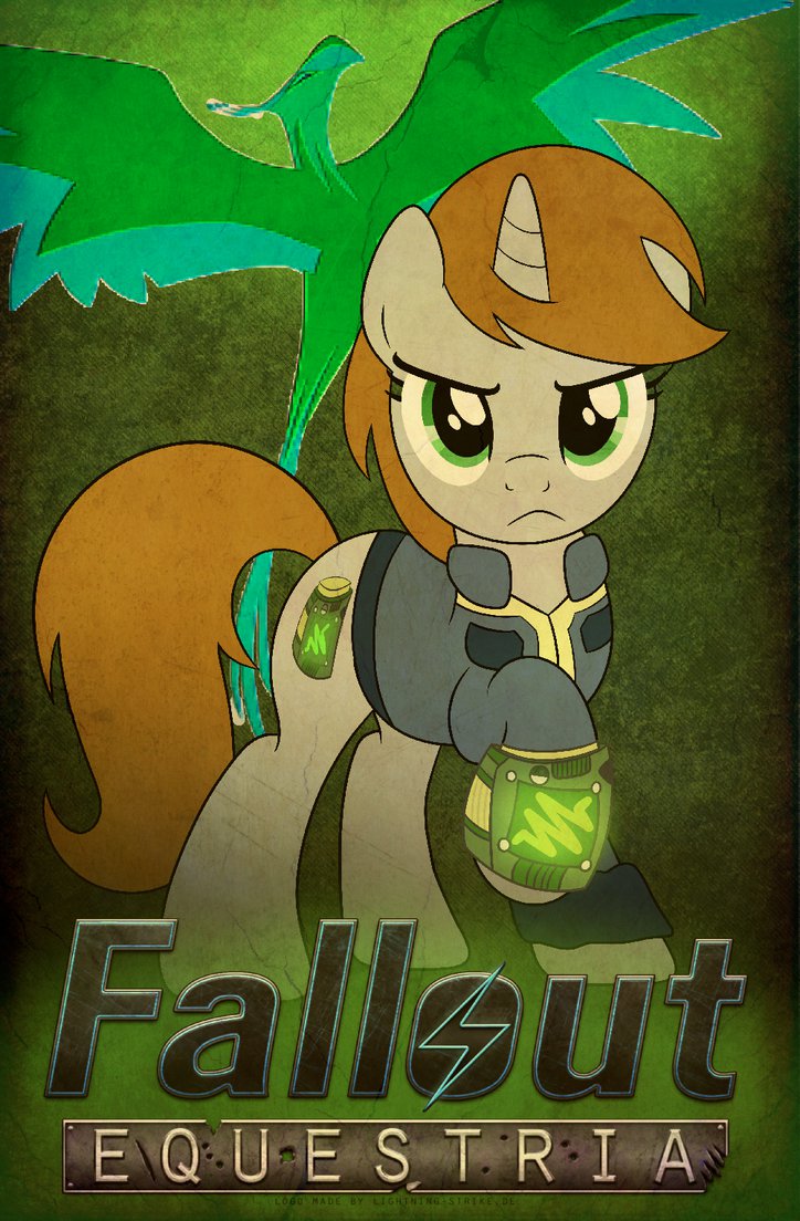
I wanted to make a new Fallout:Equestria poster for this convention season. It’s way more true to the Fallout style and way more awesome!
This is where the logo is from. The logo you see here is a placeholder to get the composition right. It will be changed:
http://lightning5trike.deviantart.com/art/Fallout-Equestria-Logo-300206025
The phoenix is also a placeholder and I am in the process of vectoring it. ~Drawponies
From: http://sta.sh/014mjheyjsnl
I’mm too ‘hic’ image descriptioned to read the ‘hic’ drunk!
Apparently you didn’t read the description.